Have you ever questioned why you are intuitively drawn to something? Your subconscious takes a hold and you have no idea why.
Four years ago, I was in the Scotland Street Museum in Edinburgh having a look at the National Museums of Scotland newly opened design galleries, and I was drawn towards some colour swatches of incredibly textural, boldly coloured yarn. Their creator was the late textile artist and designer Bernat Klein. To be honest, mohair and Chanel was not really my thing as tom-boy kind of child, nevertheless, something in me now needed to know more. There was a photograph of his award-winning design studio (Peter Wormsley 1973). Now derelict (albeit listed) the concrete and glass architecture drew me, edging on brutalist there was a confidence in this building and I needed to discover more about this man and his work.

The now derelict High Sunderland Studio by Peter Wormsley.
Klein’s work had, like a tiny seed, been growing away inside my creative head ever since the day as a child, we moved into our first army quarter to be furnished with G-Plan. It was 1974. Out was utility furniture with tasteful William Morris “Chrysanthemum” loose covers in blue. In were blocky chairs, a cacophony of vibrant oranges and yellows, or purples and blues, all covered in 100% stretch nylon covers. My mother was horrified. I was fascinated. What I didn’t know, when I saw the swatches in the museum was that Klein was responsible for these new interiors, probably the most ambitious government commissioned design project since the war.

Dress by Bernat Klein, exhibited in the archive at Heriot Watt University.
Yugoslavian born Klein grew up with textiles; his father ran a wholesale business. It was a natural progression for him to attend Bezalel School of Arts and Crafts in Jerusalem, a progressive establishment where a number of his tutors were from the Bauhaus or former pupils from this reknown German art school. In 1945 Klein came to Leeds University to study Textile Technology. As both Technician and Artist he soon found his home in the Borders working for Monrospun, at the heart of the woven textile industry. It was in the early 60s when Klein came to prominence with space dyed mohair couture for Coco Chanel, taking the fashion industry by storm with her 1963 collection. On an upwards trajectory yet seeking fresh opportunity for the development of new ideas, in 1966 Klein established Bernat Klein Design Consultants and it is at this point in his career his interior work began to take centre stage.

Tweed Sample from apparel fabric range
Bernat Klein was utterly unique in his ability to balance art with technology. His signature being what he referred to as “colour balancing”, he combined different colours of the same weight and tone to (in Klein’s words) form a pleasing effect. Visual influences he attributes to “pointillism” primarily to the work of Georges Seurat, a French Post-impressionist painter. The painting technique involves tiny dots of colour built to form images. This was what Klein took as the foundation for his innovative approach to textiles.
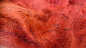
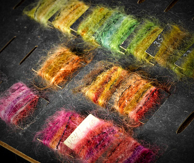
Space dyed yarn from Bernat Klein
Using new technology Klein developed the “space dying” process where yarns dyed with different colours in overlapping sections along their length. This process not only greatly increased the number of colours that could be achieved in one length, the colour palate was there in the fibres itself enabling his colour balancing theory to be played out before weaving had even begun. Add into this the textural element of Klein’s work and the results were progressive.
The crossover into interiors came firstly from Scandinavia where Klein was well established in the fashion market. It was however Margo Fabrics Ltd who significantly commissioned Klein to design upholstery fabrics and interior textiles for their business in Gateshead. His pioneering approach to colour and his international reputation won Klein the Council of Industrial Design award in 1969. It was therefore inevitable that his work was to be the first choice for the Labour Government brainchild project to re-think the design of all the government interior spaces.
Government intervention in design was not new. The Utility scheme from 1941 arose from necessity during the Second World War however by the late 1960’s, associations with the scheme and the furniture itself was tired. Attitudes to state sponsored design was by now changing. In 1951, the paternalistic attitude of planners, architects and designers involved with the Festival of Britain believed they knew what the public wanted. Society was becoming individualistic with a growing mistrust of establishment; it was right that new work must reflect this wider attitude.
The monochrome of modernism and the delicacy of the 1950s interiors were no longer to the public taste. Major public buildings were in need of a facelift, grey and soulless. With continued expansion of the armed forces, new universities, and an expanding welfare state, the government was faced with a major procurement programme. In order to deliver such an ambitious project, good design needed to be at the very core. The scheme was for a range of colour coordinated options in furnishing fabrics and carpets, to make it easier for government staff to order interior schemes that would naturally work well together. Klein was the obvious choice for the task. This was an astounding brief to include interiors from art galleries, embassies, hospitals to the smallest domestic quarters. Klein rose to the challenge culminating in the exhibition “Kaleidoscope: Diversity by Design” held at the Design Centre in London in 1971.

Cover for Coordinated Colour Guide for Interiors Bernat Klein

Colour guide Russet, carpet and fabrics.
Klein produced three volumes of “The Coordinated Colour Guide for Interiors” containing colour balanced textile samples, photographs of room settings and guidance, thus allowing Supplies Division staff anywhere in the world to, at a glance, deliver interiors in a timely way from a centralised source using the economies of scale. Again, colour balancing was the key, both in fabrics and within the collection itself. Britain was now firmly in the age of the consumer, an age of individualism. The new scheme was heralded by the Department of the Environment to “suit all tastes” shifting away from the uniformity and narrow perspective advocated by the modernist principles.

Fabric swatch from the Coordinated Colour Guide for Interiors Bernat Klein
In reality the ambitious nature of the scheme clearly wasn’t to everyone’s taste; my own recollection was that the “colour balanced” nylon stretch covers were akin to psychedelic camouflage to the subdued tastes of my mother’s generation. But Britain had experienced pop art and culture of the 1960s and although Klein was not largely influenced by this, his work was a perfect for a society that was emerging into the post-modern age of individualism and choice. The modernist concept that colour was a distraction was long gone and the extravagance of colour advocated by Klein’s approach was a perfect fit. The Department of the Environment Supplies Division was at that time the largest purchaser of textiles in the country in an age where home manufacturing was shifting away to developing countries on the basis of cost. Positive government support for design and efforts made to improve the standard of interiors within these diverse interior spaces showcased both British design and British manufacture to the world. It is incredible that (with the exception of Klein’s own archive now held at the Herriot Watt University in Galashiels) – for all the resurgence in fashion for mid-century design, very little is known, or remains of this bold commission for a new age in interiors.
I would like to thank Helen Taylor from Heriot Watt University, Galashiels Campus for allowing me access to the Bernat Klein Archive – 22nd November 2018.
Other Sources – Bernat Klein, A life In Colour, Bernat Klein: Colouring the Interior by Fiona Anderson All Photographs copyright Sarah E Shephard

Coordinated Colour guide, soft furnishings
To see Sarahs work click here
Have you ever questioned why you are intuitively drawn to something? Your subconscious takes a hold and you have no idea why.
Four years ago, I was in the Scotland Street Museum in Edinburgh having a look at the National Museums of Scotland newly opened design galleries, and I was drawn towards some colour swatches of incredibly textural, boldly coloured yarn. Their creator was the late textile artist and designer Bernat Klein. To be honest, mohair and Chanel was not really my thing as tom-boy kind of child, nevertheless, something in me now needed to know more. There was a photograph of his award-winning design studio (Peter Wormsley 1973). Now derelict (albeit listed) the concrete and glass architecture drew me, edging on brutalist there was a confidence in this building and I needed to discover more about this man and his work.
The now derelict High Sunderland Studio by Peter Wormsley.
Klein’s work had, like a tiny seed, been growing away inside my creative head ever since the day as a child, we moved into our first army quarter to be furnished with G-Plan. It was 1974. Out was utility furniture with tasteful William Morris “Chrysanthemum” loose covers in blue. In were blocky chairs, a cacophony of vibrant oranges and yellows, or purples and blues, all covered in 100% stretch nylon covers. My mother was horrified. I was fascinated. What I didn’t know, when I saw the swatches in the museum was that Klein was responsible for these new interiors, probably the most ambitious government commissioned design project since the war.
Dress by Bernat Klein, exhibited in the archive at Heriot Watt University.
Yugoslavian born Klein grew up with textiles; his father ran a wholesale business. It was a natural progression for him to attend Bezalel School of Arts and Crafts in Jerusalem, a progressive establishment where a number of his tutors were from the Bauhaus or former pupils from this reknown German art school. In 1945 Klein came to Leeds University to study Textile Technology. As both Technician and Artist he soon found his home in the Borders working for Monrospun, at the heart of the woven textile industry. It was in the early 60s when Klein came to prominence with space dyed mohair couture for Coco Chanel, taking the fashion industry by storm with her 1963 collection. On an upwards trajectory yet seeking fresh opportunity for the development of new ideas, in 1966 Klein established Bernat Klein Design Consultants and it is at this point in his career his interior work began to take centre stage.
Tweed Sample from apparel fabric range
Bernat Klein was utterly unique in his ability to balance art with technology. His signature being what he referred to as “colour balancing”, he combined different colours of the same weight and tone to (in Klein’s words) form a pleasing effect. Visual influences he attributes to “pointillism” primarily to the work of Georges Seurat, a French Post-impressionist painter. The painting technique involves tiny dots of colour built to form images. This was what Klein took as the foundation for his innovative approach to textiles.
Space dyed yarn from Bernat Klein
Using new technology Klein developed the “space dying” process where yarns dyed with different colours in overlapping sections along their length. This process not only greatly increased the number of colours that could be achieved in one length, the colour palate was there in the fibres itself enabling his colour balancing theory to be played out before weaving had even begun. Add into this the textural element of Klein’s work and the results were progressive.
The crossover into interiors came firstly from Scandinavia where Klein was well established in the fashion market. It was however Margo Fabrics Ltd who significantly commissioned Klein to design upholstery fabrics and interior textiles for their business in Gateshead. His pioneering approach to colour and his international reputation won Klein the Council of Industrial Design award in 1969. It was therefore inevitable that his work was to be the first choice for the Labour Government brainchild project to re-think the design of all the government interior spaces.
Government intervention in design was not new. The Utility scheme from 1941 arose from necessity during the Second World War however by the late 1960’s, associations with the scheme and the furniture itself was tired. Attitudes to state sponsored design was by now changing. In 1951, the paternalistic attitude of planners, architects and designers involved with the Festival of Britain believed they knew what the public wanted. Society was becoming individualistic with a growing mistrust of establishment; it was right that new work must reflect this wider attitude.
The monochrome of modernism and the delicacy of the 1950s interiors were no longer to the public taste. Major public buildings were in need of a facelift, grey and soulless. With continued expansion of the armed forces, new universities, and an expanding welfare state, the government was faced with a major procurement programme. In order to deliver such an ambitious project, good design needed to be at the very core. The scheme was for a range of colour coordinated options in furnishing fabrics and carpets, to make it easier for government staff to order interior schemes that would naturally work well together. Klein was the obvious choice for the task. This was an astounding brief to include interiors from art galleries, embassies, hospitals to the smallest domestic quarters. Klein rose to the challenge culminating in the exhibition “Kaleidoscope: Diversity by Design” held at the Design Centre in London in 1971.
Cover for Coordinated Colour Guide for Interiors Bernat Klein
Colour guide Russet, carpet and fabrics.
Klein produced three volumes of “The Coordinated Colour Guide for Interiors” containing colour balanced textile samples, photographs of room settings and guidance, thus allowing Supplies Division staff anywhere in the world to, at a glance, deliver interiors in a timely way from a centralised source using the economies of scale. Again, colour balancing was the key, both in fabrics and within the collection itself. Britain was now firmly in the age of the consumer, an age of individualism. The new scheme was heralded by the Department of the Environment to “suit all tastes” shifting away from the uniformity and narrow perspective advocated by the modernist principles.
Fabric swatch from the Coordinated Colour Guide for Interiors Bernat Klein
In reality the ambitious nature of the scheme clearly wasn’t to everyone’s taste; my own recollection was that the “colour balanced” nylon stretch covers were akin to psychedelic camouflage to the subdued tastes of my mother’s generation. But Britain had experienced pop art and culture of the 1960s and although Klein was not largely influenced by this, his work was a perfect for a society that was emerging into the post-modern age of individualism and choice. The modernist concept that colour was a distraction was long gone and the extravagance of colour advocated by Klein’s approach was a perfect fit. The Department of the Environment Supplies Division was at that time the largest purchaser of textiles in the country in an age where home manufacturing was shifting away to developing countries on the basis of cost. Positive government support for design and efforts made to improve the standard of interiors within these diverse interior spaces showcased both British design and British manufacture to the world. It is incredible that (with the exception of Klein’s own archive now held at the Herriot Watt University in Galashiels) – for all the resurgence in fashion for mid-century design, very little is known, or remains of this bold commission for a new age in interiors.
I would like to thank Helen Taylor from Heriot Watt University, Galashiels Campus for allowing me access to the Bernat Klein Archive – 22nd November 2018.
Other Sources – Bernat Klein, A life In Colour, Bernat Klein: Colouring the Interior by Fiona Anderson All Photographs copyright Sarah E Shephard
Coordinated Colour guide, soft furnishings
