Colour Rush!
An Installation by Sabine Marcellis at Vitra Spring 2024
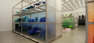
Blues and greens
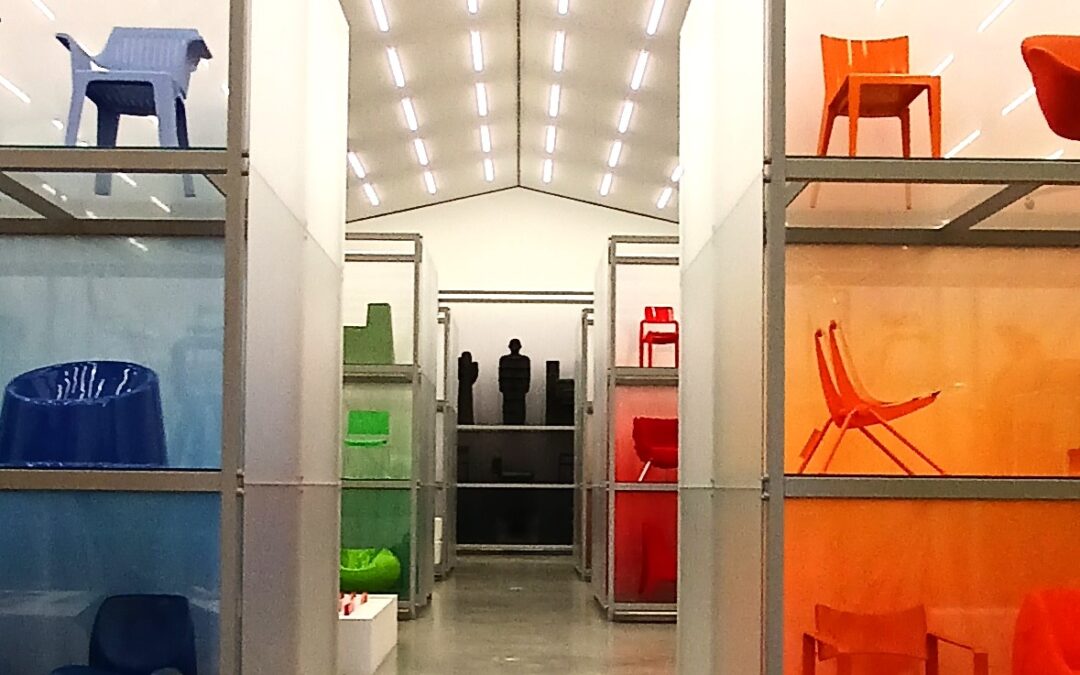
In this blog I explore colour in relationship to chair design. Colour is essential to our lives and is often an expression of who we are and the environment we choose to surround ourselves with. Back in April I immersed myself in one of the most creatively curated exhibitions I have ever seen. Colour Rush! was an installation by the Dutch artist and designer Sabine Marcellis in which she brought together the two most exciting elements for any upholsterer, chairs and colour. This tantalising display takes about 400 pieces from the archive of the Vitra and simply and effectively arranges them into colour groups. The result was stunning.
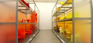
Colour Rush curation of oranges and yellows
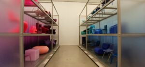
Colour Rush curation of purples pinks and blues
The exhibition, held at The Vitra Shaudepot, part of the Vitra Campus of architecture and design at Weil-am-Rhein in Germany. The Shaudepot was designed by the Basel architectural practice Herzog & de Meuron and houses archive and a permanent collection of the very best of twentieth century furniture and lighting design, becoming what is now the largest collection in Europe.
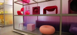
Pinks and purples in Colour Rush
The name Vitra is synonymous with chair design; the company possesses the rights to produce some of the most iconic design classics from the twentieth century. In the early 1980’s, the founders’ son, Rolf Fehlbaum acquired, for his own enjoyment, some early pieces of furniture by Alvar Aalto, Charles and Ray Eames and Jean Prouve. A collection was never in mind. By 1984 however, it was clear that a “small shed” or the likes would be needed to house the growing collection and serve Fehlbaum’s continuation of his father’s passion for architecture and design. A connection with Frank Gehry, the Canadian American Architect, (perhaps better known amongst furniture designers for his Easy Edges series of cardboard chairs) was commissioned to design the building which became the Vitra Design Museum, now hosting changing exhibitions on a spectrum of design, architecture and environmental subjects.
Over four decades the Vitra collection has grown to over 20,000 objects, 7000 of which are furniture. The collection includes the estate of Alexander Girard, Danish designer Verner Panton (including over 100 prototypes and versions his iconic S or Panton Chair) and the complete three-dimensional archive from the estate of American post-war designers Charles and Ray Eames. The aim of the collection is to document interiors, past and present, into a broader context of how we live today, and by doing so place design at the very core. The scale of the collection required a focussed direction, and a new building was conceived and opened in 2016 to house the complete archive and create a permanent display for the public.
Colour and Design
Back to colour. As a design student we were encouraged to model in pure white finish. White shows form as light reflects unimpeded from the surface. A white walled gallery is a conscious blank environment designed to reflect the maximum amount of light within the space. Dark interiors devoid of visual intrusion allow spot focus on the pieces displayed within it. It takes a very skilled eye to use colour as powerfully as Marcellis has done in Colour Rush! As counterintuitive as it may seem, her curation serves to amplify the form and texture of the objects. The scale of the exhibition, the height of the racking on which the chairs are placed, together with backscreens of intense colour fading as it rises is utterly immersive.
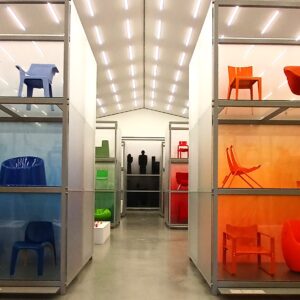
Colour Rush Exhibition, Vitra Schaudepot
I find there is something deeply satisfying about order. Order relieves the brain of having to sort the information we have in front of us. All we need to do is look. And in looking, for example, at a completely orange space, the detail of the chairs within it becomes accentuated and, incredibly, easier to see. Textures become more apparent, as does the subtle differences in tone and shade. Several pieces from Panton’s interior landscape Visiona II (one of the most radical visions of the future in twentieth-century design commissioned by Bayer AG in 1970) the vibrant, almost psychedelic colours can be fully appreciated in the Colour Rush! setting. Form becomes exaggerated, and relationships between what would otherwise be two unrelated chairs from different periods enhanced. Design is better understood.
What is colour?
Colour is electromagnetic radiation of a particular range of wavelengths interpreted by our brains through the optic sensors in our eyes. In the very simplest way, we use colour for the objects around us; colour to identify risk, instruction, define group identity and in commercial association with branding and product design.
On a deeper cultural level, colour defines our society and tradition. On an individual level it is an expression of who we are through the objects and spaces in which we surround ourselves and through the clothes we wear. Colour is at the heart of design and in defining contemporary trends, designers and artists develop their own way of interpreting colour. Sabine Marcellis herself uses colour in relationship to surface texture, working with material technology to reach her end point. Striving for dialogue with the user, her Boa Pouf shaped like a donut and the Candy Cube high gloss Perspex colour stools combine heightened aesthetic with functionality. Within the exhibition her Perspex samples demonstrate this perfectly, with a mixture of matt and reflective surfaces, tints and hues form a part of a long process of experimentation to achieve the desired result. “I rely on my instinct and on what feels right and what doesn’t”. Her instinct is perfectly echoed in the exhibition as a whole.
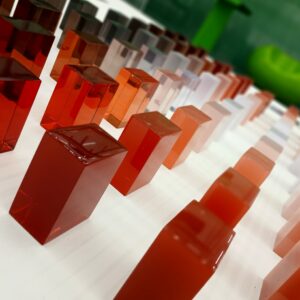
Synthetic resin samples by the Dutch artist and designer Sabine Marcellis
The formula of colour
A section of the exhibition looked at the approach several renown designers took towards using colour. Panton demonstrated a very mathematical approach to the reproduction of colour using a system based on red, blue and yellow primary colour combinations and interactions. Likewise, LeCorbusier also had his own methodical approach to colour. But modern colourimetry was pioneered by American Albert Henry Munsell, himself a painter and teacher of Art, publishing a book in 1905 called A Color Notaion: An Illustrated System Defining all Colors and Their Relation by Measured Scales of Hue, Value and Chroma. It took nearly four decades for his painstakingly researched system to be adopted as a US Standard, yet it remains widely used today. From RAL system in Germany, to DIC in Japan, it is perhaps Pantone, first issued in 1963, which formed the backbone of all printed colours based on CMYB (cyan, magenta, yellow and black) for the latter half of the twentieth century, now somewhat superseded by RGB (red, green blue) light from electronic screens we now use
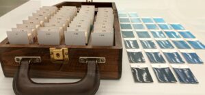
Colour card system designed by Albert Henry Munsell
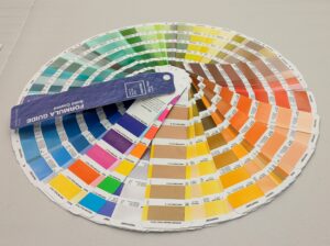
Pantone Colour Fan from 2022
Colour and time
The name Vitra is synonymous with colour and comes across in their imaginative presentation of their current range at the Vitrahaus, Vitra’s showroom also on campus. The precision of newly manufactured design classics sit in contrast with their originals as seen in the Schaudepot. Being so close to the originals, I couldn’t help myself as an upholsterer but have a sneaky touch (I know!) but touch and feel is at the very core of what we do. Hans Wegner’s fully upholstered Ox Chair filled with latex foam had unsurprisingly largely disintegrated underneath the top fabric, yet the webbing and spring stitch of Gerrit Rietveld’s Lounge Chair designed in 1937 (this example dates between 1953 and 1973), the wool covering over PU foam and polyester wadding looks pristine. Like many avant garde designs, it was probably rarely sat upon. It was so interesting to examine the detail; Mies van der Rohe Cantilever Chair is laced in a fabulous linear pattern underneath to tension the fabric; I had always assumed it was stitched.
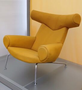
The Ox Chair by Hans J Wegner 1960
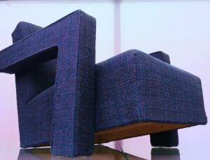
Lounge Chair designed by Gerrit Reitveld in 1937 but made several decades later. PU foam and polyester wadding under wool top fabric
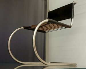
MR10 cantilever chair by Ludwig Mies van der Rohe, 1927 showing lacing on underside
Most chair design in the first half of the twentieth century was along traditional lines, that is a frame over which the foundation was applied and over that the top fabric. Top fabric held the colour and texture. As the century progressed and material and production technology advanced, colour, form and texture could be made in one. From a British perspective the iconic chair to demonstrate this has to be Robin and Lucienne Days Polypropelene chair manufactured by Hille in the 1960’s. For the next fifty years there could not have been an institution in the land that didn’t have one, some or many. But being Vitra, it has to be Vernon Panton’s S Chair that gets the mention.
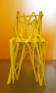
I was seriously impressed with some of the more recent pieces, The C2 Solid Chair from the French Industrial Designer Patrick Jouins Solid C3 3D printed 2004, Phillipe Starcks Louis Ghost chair from 2000; pieces that exploit technology and materials to the maximum. And with over 40 years of designing for IKEA, brother and sister duo, Knut and Marianne Hagberg piece simply made me smile. Frakta – the iconic blue bag simply filled with a cushion. With colour brings joy.

